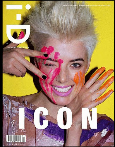
i-D
Former
art director of Vogue, Terry Jones, founded the British magazine, i-D, in 1980.
The content is specific to fashion, music, art and youth culture and is
notorious for its inventive photography and typography. i-D features people of
the creative industry and has been the breaking ground for many talents such as
Nick Knight and Wolfgang Tillmans. Also, stars such as Kanye West, John
Galliano and Madonna have appeared in i-D.
I like how i-D magazine covers are all image and very few words. I love the use of colour and print on i-D covers. This is a creative flare I want to incorporate into my design process.
http://en.wikipedia.org/wiki/I-D
I like how i-D magazine covers are all image and very few words. I love the use of colour and print on i-D covers. This is a creative flare I want to incorporate into my design process.
Pop
Pop is a bi-annually published British magazine, founded in 2000. It is a fashion forward, creative magazine that includes innovative photography, art and typography.
What I love about the covers of Pop magazine is that the model's have relatively basic hair and makeup. Pop makes it's covers artistic and creative through typography and graphology, not through the appearance of the cover models. I love the shapes and prints Pop uses on their covers images.
Wonderland features a mixture of new and established talent amongst the pop culture industry. It is an international publication that specifies it’s content to fashion, music, art and film.
No two Wonderland covers are even remotely similar and I LOVE that! There's no ongoing trend to maintain their 'signature look'. I love the way Wonderland utilises colour to create attractive magazine covers. They experiment with colour in the background, on the face of the model or in their clothes.
What I love about the covers of Pop magazine is that the model's have relatively basic hair and makeup. Pop makes it's covers artistic and creative through typography and graphology, not through the appearance of the cover models. I love the shapes and prints Pop uses on their covers images.
Wonderland
No two Wonderland covers are even remotely similar and I LOVE that! There's no ongoing trend to maintain their 'signature look'. I love the way Wonderland utilises colour to create attractive magazine covers. They experiment with colour in the background, on the face of the model or in their clothes.
http://ftape.com/media/?p=46280


No comments:
Post a Comment