Thursday, 4 December 2014

Final Evaluation


Looking back on this, I am, overall, pleased with the outcome of the Goodbye To Berlin project.  I love to learn something new and the research into 1930s Berlin has vastly expanded my knowledge. Learning about Weimar Berlin and the trends in hair and makeup during the 1930s helped me create designs that’d best represent a woman of this era.
I also enjoyed the task of working from an existent character and, with the details already provided, try to create new and innovative designs that aren’t similar to those already created.

As the designer, I feel my ability to compile informative and precise design plans has improved. This is largely thanks to continual practice as well as lessons in adapting and improving hair and face charts.
In the role of makeup artist, I feel I am better able to interpret a partner’s design based on notes and face charts. Working with my partner for this unit, the last minute issues with models and alterations in designs had me nervous and dreading the assessment. It did, however, turn out completely fine; I find the spontaneity of adapting to design alterations is a useful trait to take into the industry.

For the second part of this unit (creating the contemporary character) I found myself exploring new mediums of makeup, working with aqua and supra colours for the first time, and finally feeling confident enough to use these products in my designs.
When I started my initial research on Party Monster and the Original Club Kids, I found there was a wide range of areas I could expand my research into. However, with so many elements to factor into the contemporary character, I didn’t really know how to start.
It wasn’t until my tutorial meeting, I found a whole new muse in early 19th century art movements that really influenced my final design plans.

Technically, I don’t feel I’ve learnt a whole lot this unit that contributed to creating historical characters, however I was able to utilize some of the taught methods into my contemporary character.
For future reference, I must try to work in a linear fashion to make my blogging journey easier. I also need to focus on incorporating my research into my designs and noting the points of reference. 

Tuesday, 2 December 2014

New Berliner

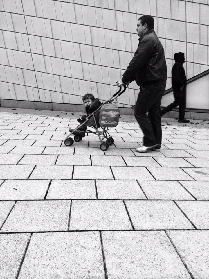
As a fun, final task for the Goodbye To Berlin project, we were instructed to run around Southampton, with our camera phones at the ready, to snap pictures in black and white, that best represented Modern Weimar Berlin. We were then to post our best 3 onto our Facebook group to share with each other. The images below are the 3 I chose to post. It was insightful to photograph everything from people to objects to scenery. It was also fun to work with different compositions and angles to capture the best pictures we could. Are we the 'New Berliners'? and are we are living in Modern Weimar Berlin? 


Monday, 1 December 2014

Creating Contemporary Character

These are the final images of my contemporary character, the Emcee. I am really pleased with the outcome, the design photos really well against a black background. I made a last minute amendment to my design... whilst I created my character, my course leader, Sharon, suggested I extend the brow to follow the contour of the cheek so I rounded off my model's brow into a spiral. 
I'm glad I worked the look around my model because I was able to achieve better results this way. As for room for improvement... if I were to start over, I would perhaps try and keep the curls really bouncy, securing them better with hairspray. Also, working in a warm studio and the heat of the photography light meant the supra colours were warm on the face and extra greasy to work with. I know setting them with powder is difficult (I've tried many a time) but I could look into other methods of setting supra colours. 


Sunday, 30 November 2014

The Emcee Hair Design


Because I have already secured a model, I have designed the hairstyle around my model's unique hairstyle. My model's hair is shaved at the sides and long on top. In order to maintain elements of the 1930s in my design, I have chosen to incorporate curls as I also feel they appeal to the contemporary aspect as well. These images are my ultimate contemporary inspiration for my hair design. 


My design includes the long hair on top being curled using barrel curling tongs. As for the rest of the hairstyle, my Emcee is a top performer, he is the headlining act and the STAR of the show. I think it would be in his creative personality to give recognition to this in his hairstyle. I have decided to use stencils to create stars on the shaved part of my model's head. 

I created my own star stencils of various sizes out of a sheet of craft foam. I drew a star onto a square of foam and them cut it out to get a stencil. When I first practised stencilling on my model, I used aqua colours, sponging them onto the head within the stencil. The result, very faint colours. The shape of the star was sort of visible but no matter how many layers I applied, the colour was very washed out. 
After the aqua colour fail, I tried using coloured hairsprays, the novelty wash-in, wash-out ones you can buy at fancy dress stores. The colour was bolder using the sprays however, because my model's hair is very fine and short, it was as though I was spraying onto the skin. The product ran and the shape no longer resembled a star.   
The third medium I chose to test was supra colours and, third times a charm, it worked really well. I used a small brush to apply supra colour within the star stencil and it showed up really great, I was able to achieve perfect star shapes and the product stayed in place. 


Practising the curls 

Using aqua colours & coloured hairspray
Using supra colours


Products and equipment needed:
  •  Small barrel curling tongs
  • Heat Defence Spray
  • Dry Shampoo
  • Hairspray
  • Sectioning Grips
  • Hair brushes inc. pintail comb
  • Star shaped stencils
  • Supra Colour Palette
  • Method:


1.    Prep the hair with heat defence spray and dry shampoo if necessary
2.    Curl the entire top section of hair in small sections, releasing from the tongs carefully so the curls maintain their tight formation
3.    Fix the curls with hairspray
4.    Hold star stencil to the head and fill with supra colour as indicated by design


The Emcee Makeup Design 3 (Final Design)

After experimenting with my first two designs, I reevaluated my research points and was inspired by the following contemporary images.. 


From these images, I devised my final makeup chart. I am using a red and black colour scheme, colours I associate with circus ring leaders, an act I relate closely to the Emcee. Around the eyes, I use supra colours to create a fade of colours down the cheek from black to dark red, primary red, and then white. I used a quick brush technique to create the effect, similar to that used in Impressionism. 
The eyelids are covered with a wash of black eyeshadow, the eyebrows are filled in with a M.A.C black pencil and false eyelashes (Eyelure 143) are applied to give thick, luscious lashes. On the lips, I line with black supra colour, extending a little at the corners of the mouth. I then fill the lips in with dark red and a touch of white in the centre.  The cheeks are heavily contoured with the combination of dark Kryolan foundation and NYX matte brown bronzer. 

I really love this design, I think it better relates to my character than the previous two. I also think it will look really great on my model considering his great bone structure. 


Products and equipment needed:·      
  • Makeup Brushes
  • Disposable applicators
  • Tweezers
  • Kryolan Foundation Palette
  •   Illamasqua Loose Powder
  •  Bobbi Brown Gel Eyeliner
  •  Eyelure False Eyelashes #143
  •  Duo Adhesive
  •   Revolution ‘Flawless’ Eyeshadow Palette
  •  Supra Colour Palette
  •  MAC Black Pencil
  •  Maybelline ‘False Lash Effect’ Mascara


Emcee Inspo on Pinterest. 2014. Emcee Inspo on Pinterest. [ONLINE] Available at: http://www.pinterest.com/danikayasmin/emcee-inspo/. [Accessed 01 December 2014].


Saturday, 29 November 2014

In Class Presentation & Feedback (Contemporary)


These are screen shots from the presentation I had planned on delivering to my class about my contemporary character. Unfortunately I didn't get around to presenting but I did share it with some peers as well as my course leader, Sharon, and was able to  receive some insightful feedback. 


The feedback I received from my presentation was:


  • The initial ideas for the Emcee are good
  • There needs to be more references to inspiration outside of the Club Kids and editorial images
  • Look at art movements of Impressionism, Pointillism and Cubism 
  • Look at Picasso's women and Matisse's drawings
  • Perhaps attempt two versions of your Emcee and present both on your blog, explaining why you prefer one over the other
  • Show your inspiration for the stars on the Emcee's hair design
  • Explain on your trials, what products worked successfully, what didn't work 


The Emcee Makeup Design 2

For my second design, I decided to go in a completely different direction. In the first couple of practical lessons with Lottie, she taught us the application of aqua an supra colours to create abstract art on the face. I really enjoyed working in this style and decided to incorporate it into my second design on the lips. 

I also decided to use this face chart to experiment with different textures. After applying brushes of supra colour onto the lips, I applied glitter, for a contemporary effect. I also worked texture into the eyebrows, sticking coloured rhinestone gems to different parts of the brow. 

I feel the colour scheme I used for the first design was a broad spectrum that didn't necessarily have any connection to the 1930s or my character. I therefore, decided to adopt a narrower band of colours for his design, working primarily with red with hints of yellow and green. The red is a reflection of the 1972 Cabaret Emcee, where he would wear red on the lip and cheek. 

Looking at the design, having put it onto a face chart and also practised on myself, I feel I've tried to include too many elements. I like the idea of using a red colour scheme however I feel this design is a too clown-like and quite tacky. I love working with the abstract technique and hope this is something I can continue into my final makeup design.